.png)


Design Projects
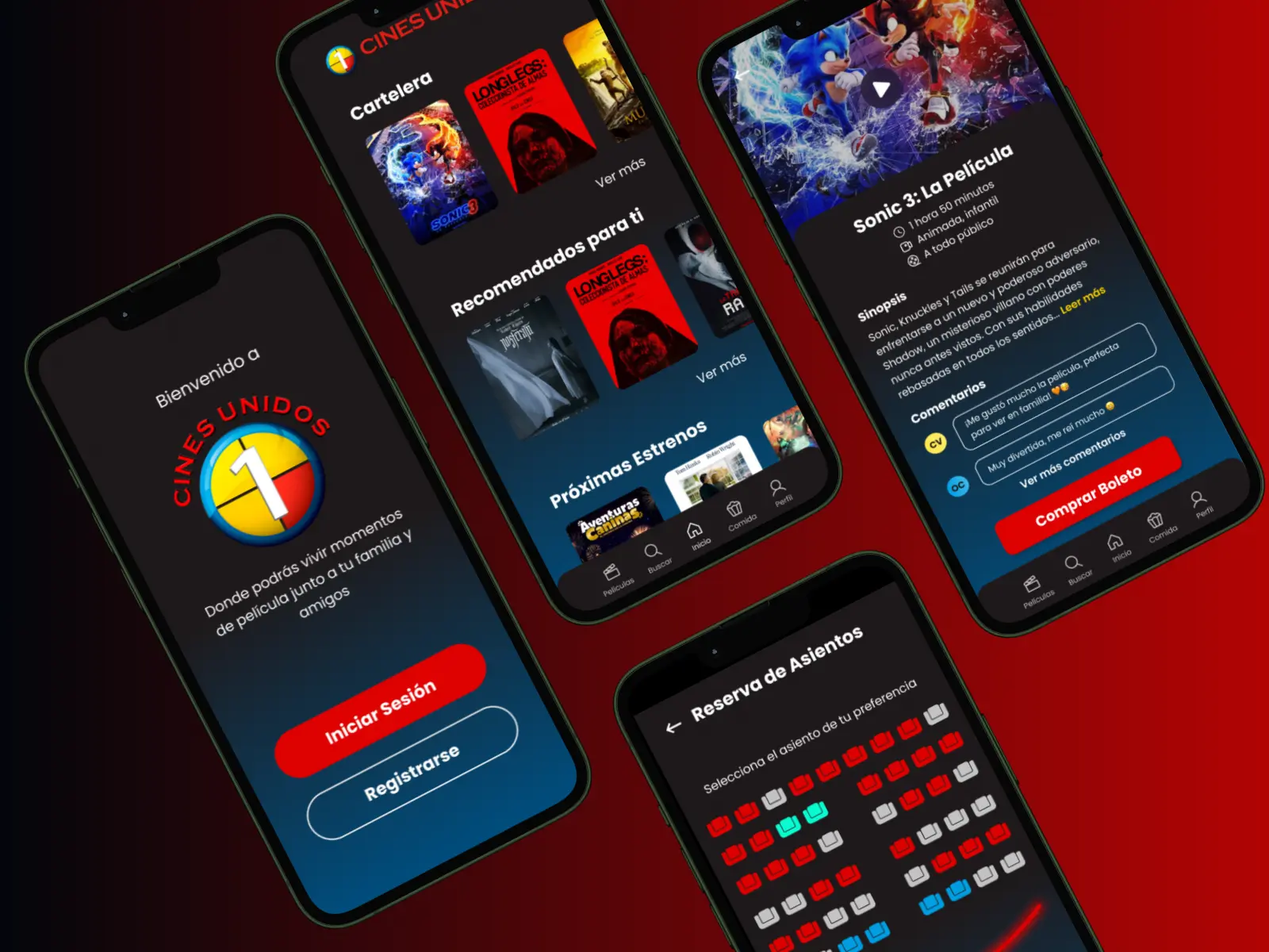
Cinema App

Cines Unidos, a well-known cinema chain, lacked a dedicated mobile application, making it difficult for users to browse movies, book tickets, and stay updated on promotions.
To address this, I designed a modern and user-friendly mobile app that reflects the brand’s identity while enhancing the moviegoing experience.
The Challenge
The existing Cines Unidos website had a somewhat complex structure, making navigation and ticket booking a tedious process. Some sections felt unintuitive, requiring multiple steps to complete a reservation. Additionally, the website’s design wasn’t fully accessible to all users, with issues related to font sizes and color contrast. My goal was to simplify the experience by creating a mobile app that is intuitive, easy to navigate, and inclusive for all audiences.

The Wireframe
To conceptualize the app, I created a low-fidelity wireframe outlining the main screens and user flow. This sketch-based prototype allowed me to visualize the structure, layout, and key functionalities before moving into high-fidelity design. The wireframe includes essential screens such as the home page, movie selection, ticket booking, seat selection, payment, and user profile, ensuring a seamless and intuitive navigation experience.

The Solution
The mobile app design incorporates Cines Unidos’ brand colors, a clean interface, and intuitive navigation. Key features include a streamlined booking system, personalized recommendations, and an organized layout for movie schedules. The design ensures accessibility for all users, making the ticket-purchasing process effortless and efficient.

The Result
The final design presents a visually appealing and highly functional app that enhances customer engagement. The interface is user-friendly, aligning with modern UX/UI standards, and offers an improved moviegoing experience. With seamless navigation and an efficient ticketing system, the app makes it easier than ever for users to enjoy their favorite films.
Website Re-Design

This project focused on the complete redesign and optimization of the Smart Claims Administration website. The goal was to improve the user experience, elevate the brand’s online presence, and ensure the site was responsive and SEO-optimized. My role involved user research, UX/UI design, and full WordPress implementation using Elementor, all while aligning the outcome with the business’s needs and improving its visibility across search engines.
The Challenge
The biggest challenge of this project was working under a tight deadline due to its urgent nature. I had to carefully plan and manage a fast-paced workflow that included user research, stakeholder interviews, UX/UI design, WordPress development, responsiveness, and SEO optimization—all within a limited time frame.
Another significant challenge was translating every detail of the Figma design faithfully into Elementor in WordPress. Maintaining pixel-perfect design accuracy and ensuring that the layout, typography, spacing, and responsiveness matched the original design across all devices required special attention and advanced customization within Elementor’s limitations. Balancing speed and precision was key throughout the entire process.

The Wireframe
The wireframing stage involved creating low-fidelity mockups that allowed for quick structural decisions and validation of the user flow. I also used the previous version of the website as a reference to identify areas for improvement and better understand the content architecture. These sketches and early designs helped define the layout for the final interface and guided both the design and development phases effectively.

The Solution
To solve the challenges and meet the goals, I developed a clean, modern, and professional design that reflects Smart Claims Administration’s identity and mission. I conducted user-centered research to shape a design that’s easy to navigate and visually aligned with the brand. Then, I implemented the design in WordPress using Elementor, carefully optimizing it for mobile responsiveness, loading speed, and SEO best practices.
The solution also involved organizing content in a way that enhances trust and credibility, integrating key sections like services, contact forms, blogs, and FAQs, while ensuring accessibility and performance across all devices.

The Result
The final result was a fully redesigned, responsive, and SEO-optimized website that elevated Smart Claims Administration’s online presence. The site now offers a seamless user experience, fast load times, and improved search engine performance. Every section of the original Figma design was implemented with high fidelity in WordPress, ensuring a consistent and professional brand experience across all screens. The client was satisfied with the outcome and the website is now ready to serve its users effectively and reliably.

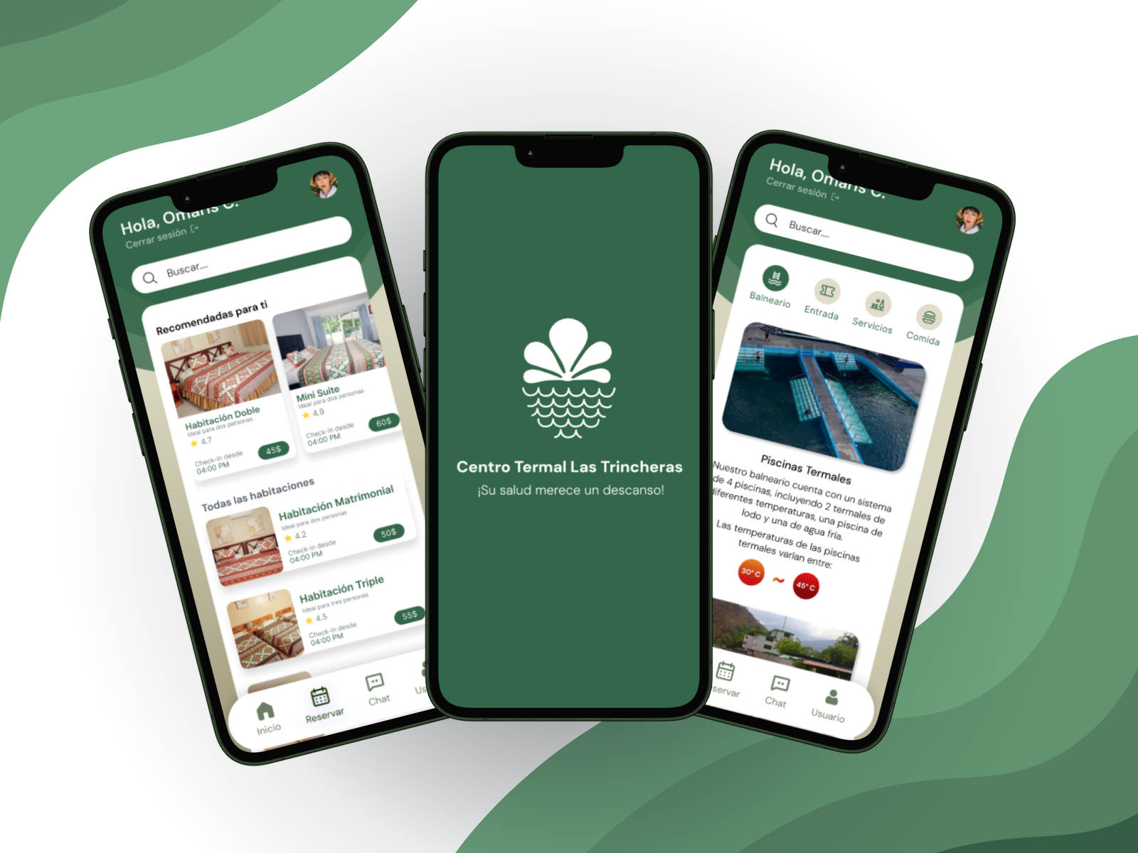
Thermal Springs

I designed a mobile app that allows visitors to book accommodations, explore spa services, view pricing, and navigate through all available facilities seamlessly. The goal was to create an intuitive and visually appealing solution that enhances accessibility and streamlines the booking process for all age groups.
The Challenge
Despite having a website, Las Trincheras did not offer an online booking system, requiring customers to call for reservations. This outdated approach limited user convenience and did not align with modern expectations in the hospitality industry. Additionally, the company attracts visitors of all ages, from young travelers to senior guests, so the app needed to be intuitive, accessible, and easy to navigate for a diverse audience. Ensuring clarity in the UI while maintaining a visually appealing design was a key challenge in the project.

The Solution
To address these challenges, I designed a user-friendly mobile app with a modern interface that simplifies navigation and enhances the customer experience. The design incorporates a seamless booking system for rooms, spa treatments, and entrance tickets, eliminating the need for phone reservations. Additionally, I structured the app to provide clear and organized information about thermal pools, restaurants, and wellness services, ensuring that users can easily access what they need. The interface follows an accessible and visually engaging layout, making it easy for users of all ages to explore and book their visit effortlessly.

The Result
The final design successfully transformed the Las Trincheras experience by streamlining reservations and improving service accessibility. Users can now book their stay, explore available services, and navigate the spa's offerings with ease. The app provides a modern, visually cohesive platform that aligns with the company's identity, ensuring a smoother and more enjoyable experience for all visitors. By integrating intuitive navigation and a refined booking system, this project enhances the overall digital presence of Las Trincheras and meets the needs of its diverse customer base.
Website Re-Design
%20(1).webp)
Gao Tek Inc., a global supplier of test and measurement equipment, needed a website redesign to improve usability, readability, and overall user experience. The existing site was cluttered, visually overwhelming, and difficult to navigate. My task was to create a modern, structured, and engaging design that effectively communicated information while maintaining the brand’s identity.
The Challenge
The original website was heavily text-based, with information densely packed into large blocks, making it difficult to read and navigate. The lack of white space and visual hierarchy created a poor user experience, especially for new visitors. The website also needed a refreshed, modern design that aligned with industry standards while maintaining the company's branding.

The Solution
To improve the website's usability and visual appeal, I restructured the content by breaking down dense text blocks into well-organized sections, making information easier to digest. I introduced a modern layout with a clear visual hierarchy, ensuring that key elements stood out while maintaining a clean and professional look. The redesign incorporated the company’s branding while optimizing spacing, typography, and navigation for a more seamless user experience. Additionally, I ensured full responsiveness, allowing the website to adapt smoothly across different devices without compromising functionality or readability.

The Result
The final design significantly improved user experience by making the website more intuitive and visually appealing. The structured layout allowed users to find relevant information faster, increasing engagement and accessibility. The new design also strengthened the company's online presence by presenting a professional, modern interface that effectively showcased its products, services, and job opportunities.

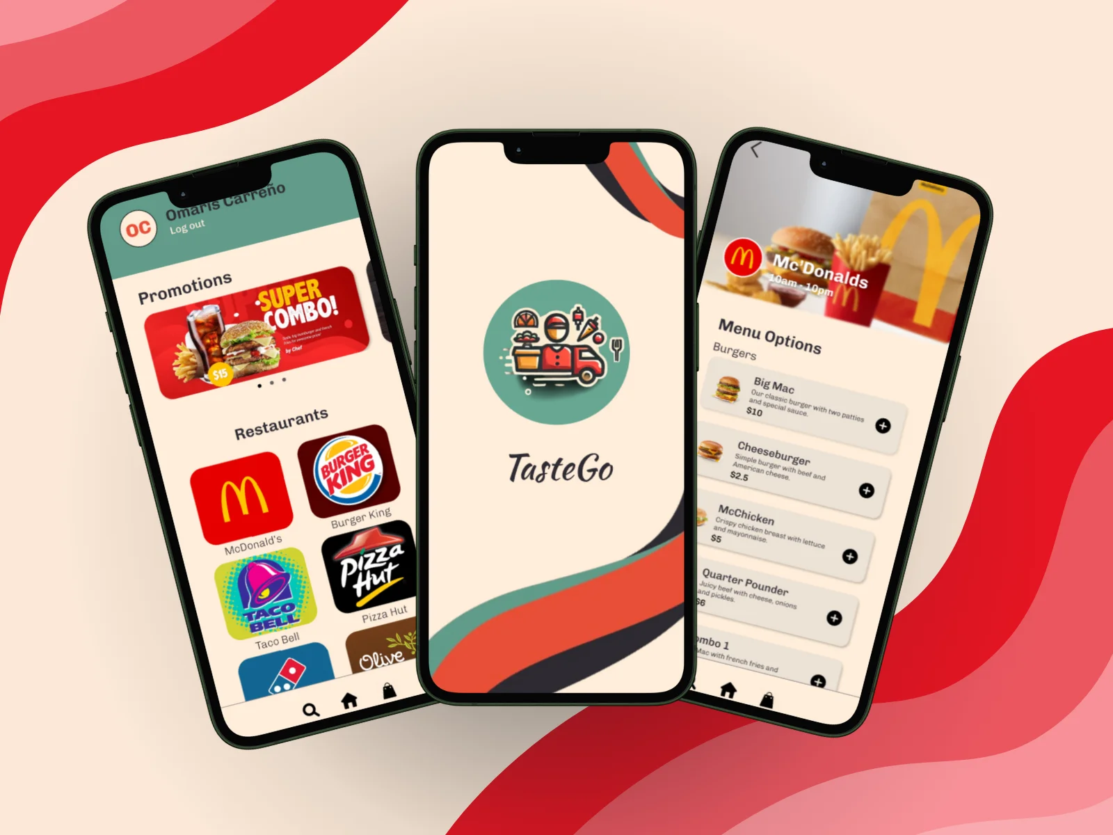
Delivery App

As part of my internship at Gao Tek, I was assigned the task of designing a mobile delivery application from scratch, following the company’s guidelines. The goal was to create a modern, user-friendly application tailored for both young and adult users, ensuring a seamless and intuitive experience. The project required careful planning, a clean visual design, and the inclusion of all essential screens to facilitate smooth navigation and interaction.
The Wireframe
I created a wireframe to establish the application's structure and user flow. This wireframe served as the foundation for the layout, helping to define the arrangement of elements across different screens. It ensured logical navigation, efficient information display, and an optimal user experience by outlining the placement of buttons, menus, and key interface components.

The Solution
To build an efficient and visually appealing delivery application, I structured the interface with clear sections, prioritizing accessibility and ease of use. The design incorporates modern UI elements, a well-balanced color scheme, and intuitive icons to guide users effortlessly through the ordering process. Every screen was crafted to enhance usability, from restaurant selection to order tracking and customer support.

The Result
The final design of TasteGo successfully delivers a user-friendly and visually engaging food delivery experience. The well-structured layout, smooth navigation, and responsive design ensure an effortless ordering process. By integrating essential features like real-time tracking and chat support, the app provides a complete solution that meets user needs while maintaining a modern aesthetic.